http://www.financialplanningsouthafrica.com/long-range-financial-planning.html
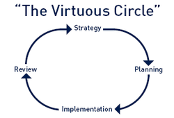
Diagram number one presents a shortened, condensed version of the financial planning process. The style of the diagram implies that financial planning is ongoing – a never-ending cycle. Of the three diagrams, “The Virtuous Circle” is least effective in portraying the financial planning process because it overlooks the specific steps involved in the process. Rather than being more descriptive and concrete, diagram number one offers a more abstract interpretation of the steps involved in the process. The stages lack clarity, as well as distinguished starting point. The font’s blue color is appealing to the eye, though still has the weakest visual rating. The diagram’s font is rather dull; a more bold style would improve the diagram’s attractiveness.
http://www.pentad.com.au/planning-process

Diagram number two also illustrates the financial planningprocess as a continuous cycle. But, there is still no determined beginning point. This diagram includes more specific, additional phases of the planning process in comparison to diagram number one. However, it excludes an essential part of the financial planning process – establishing and defining the client relationship. This diagram two recognizes the importance of obtaining enough of the client’s data in order to identify goals and objectives; the significance of having a financial plan to follow is emphasized – better in this diagram than the other two. Diagram number two offers a more striking, eye-catching image of the process. The stages are more understandable and accurately placed than compared to diagram number one. Also, the font is bolder and the colors being used really complement one another, making it easier to read while remaininginterested. As a result, diagram two is ranked second for visually and accurately implementing the financial planning process.
http://www.aequitas-nh.com/Pages/the-planning-process.html

Diagram number three delivers the most accurate description of the financial planning process. Even though the style is delivered differently than the circular cycle in diagram one and two, diagram three still illustrates financial planning to be an ongoing process. As all three diagrams lack a descriptive idea of the steps involved within the cycle, diagram three offers
the most comprehensive idea of what exactly happens within each of the phases. Diagram number three recognizes the first phase of the financial planning process – to establish and define a client-planner relationship, while diagram one and two fail to do so. This flow chart illustrates how the process loops back to “analyze and evaluate financial status” as the variables of individualized plans are constantly changing. In line, it shows the significance of rebalancing the inevitable changes that occur in life, and how absorbing those changes will help sustain a risk/reward relationship within the plan. Different from the other two continuous cycles, diagram three doesn’t go from the completing the last stage back to the first, but rather begins at the third stage. The appearance of this diagram is presented in a flow-chart fashion –with much more details that appear at the eye. For instance, all of the stages listed are presented within a box except for the last stage, “monitor and review plan.” I believe this is due to the continual monitoring and revising that occurs within the financial planning process. Also, whenever the process gets revised, the next step to take would be to “analyze and evaluate financial status,” unlike what diagram one and two present. The colors being used allow the diagram to be easily understood and implemented. Overall, I think diagram three is most effective in visually and accurately depicting the financial planning process.
the most comprehensive idea of what exactly happens within each of the phases. Diagram number three recognizes the first phase of the financial planning process – to establish and define a client-planner relationship, while diagram one and two fail to do so. This flow chart illustrates how the process loops back to “analyze and evaluate financial status” as the variables of individualized plans are constantly changing. In line, it shows the significance of rebalancing the inevitable changes that occur in life, and how absorbing those changes will help sustain a risk/reward relationship within the plan. Different from the other two continuous cycles, diagram three doesn’t go from the completing the last stage back to the first, but rather begins at the third stage. The appearance of this diagram is presented in a flow-chart fashion –with much more details that appear at the eye. For instance, all of the stages listed are presented within a box except for the last stage, “monitor and review plan.” I believe this is due to the continual monitoring and revising that occurs within the financial planning process. Also, whenever the process gets revised, the next step to take would be to “analyze and evaluate financial status,” unlike what diagram one and two present. The colors being used allow the diagram to be easily understood and implemented. Overall, I think diagram three is most effective in visually and accurately depicting the financial planning process.
The three different diagrams all relate to the financialplanning process in their own, unique way. Understanding the different perspectives that each diagram illustrates provides a better awareness of the similarities and differences that occur within the planning process. As a result of comparing and contrasting different processes, I continue to gain more knowledge and self-confidence in which will allow me to successfully implement the financial planning process in my future.